O’Coffee
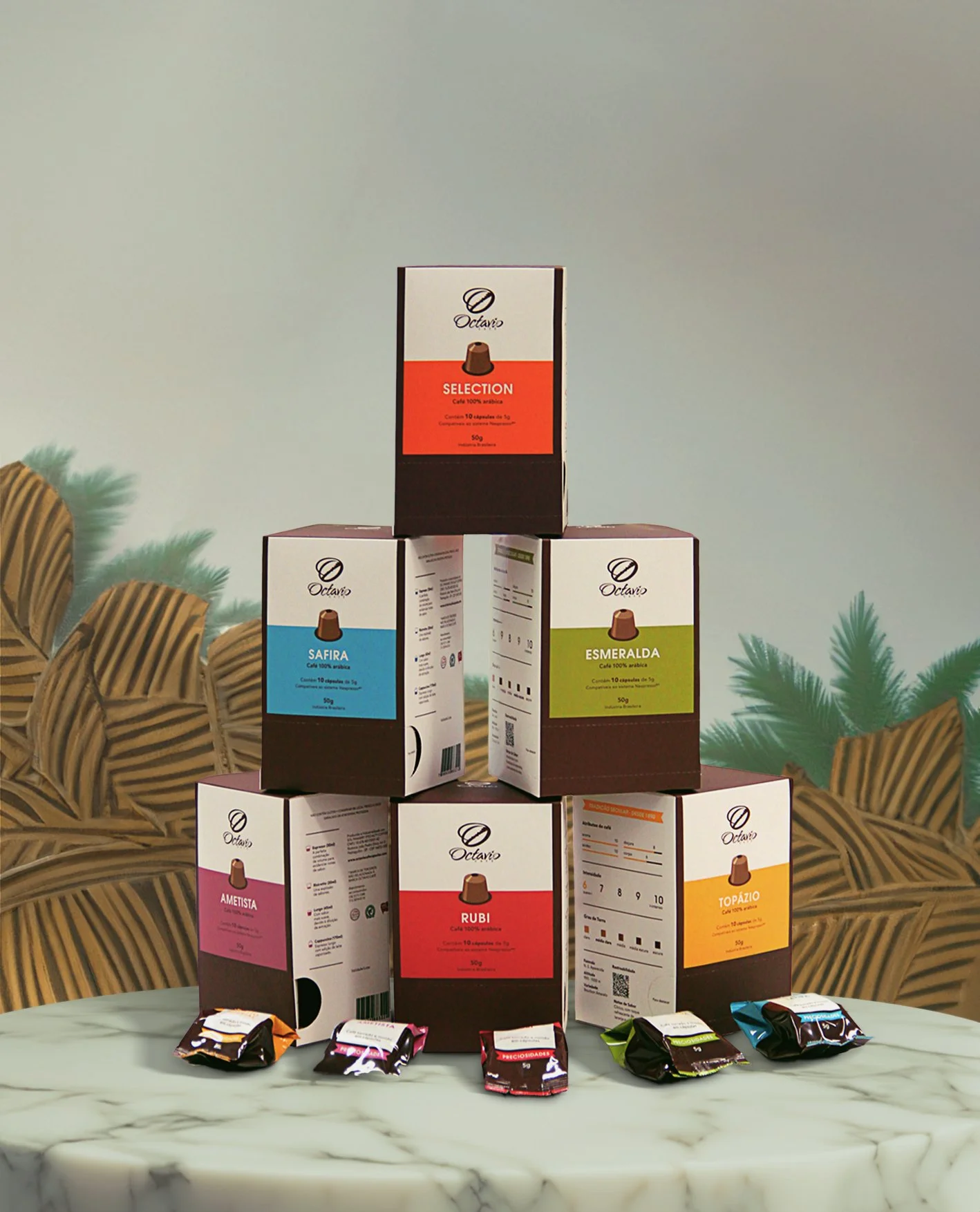
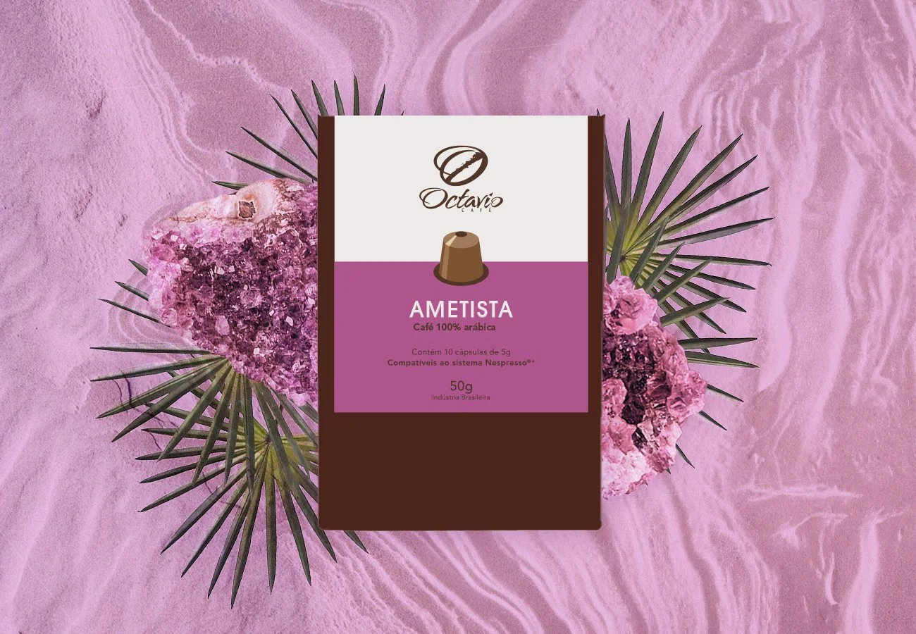
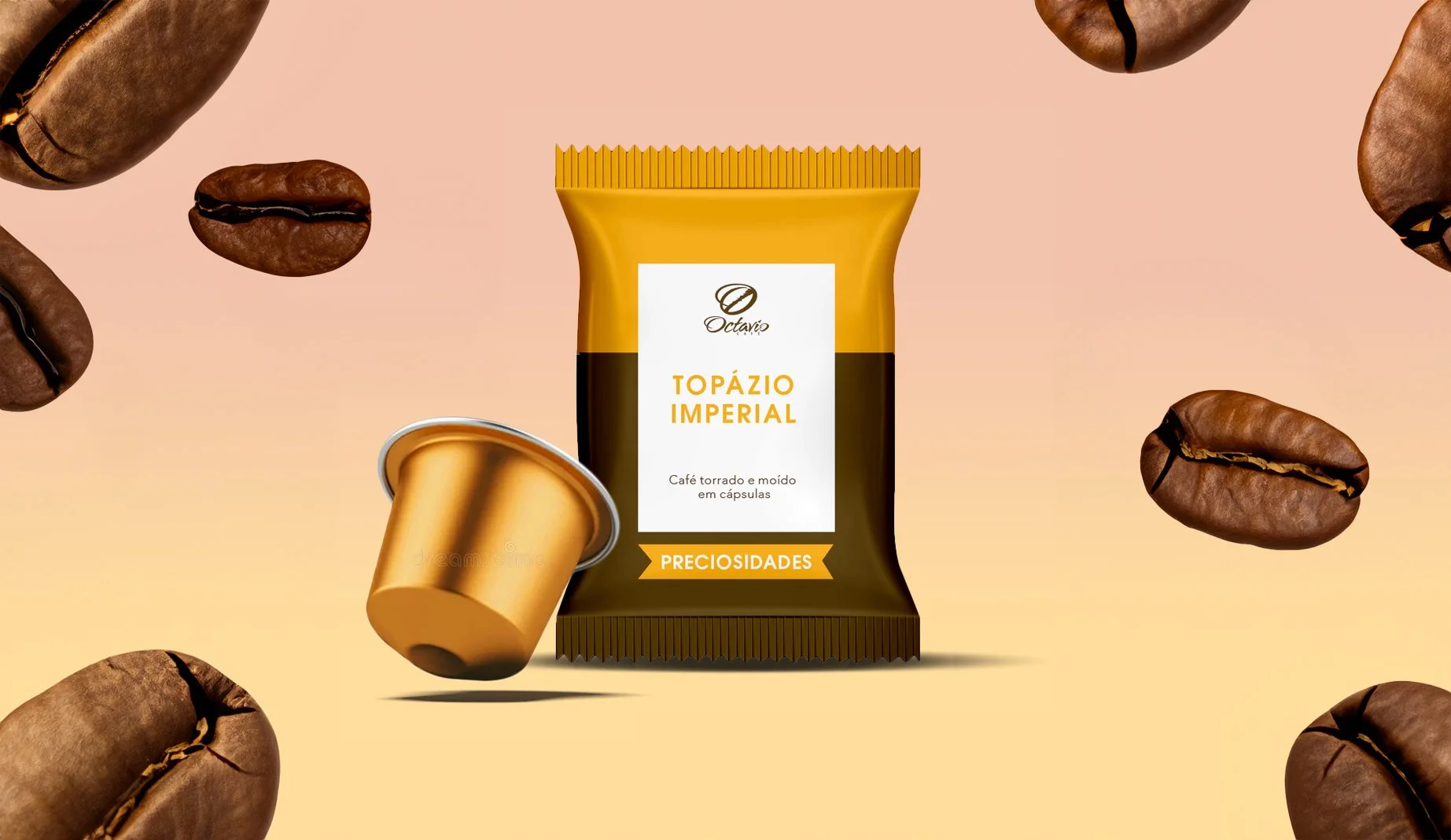
A prominent coffee vendor with a long tradition, Octavio Cafe was entering the capsule industry by launching a line of seven coffee capsules, each of which would be as distinct as a valuable stone. The concept was to align each coffee variant with the meanings associated with specific stones.
Design Process
The challenge in creating the capsule set was balancing the corporate identity of Octavio Cafe—a company renowned for its dedication to quality and excellence—with the opulence of precious stones.
My goal was to encourage customers to take risks with a range of unique coffee tones by contrasting the opulent quality of jewels with an inviting and friendly design.
Empowering consumers
In order to convey the subtle differences between each type of coffee, an infographic guide was incorporated into the packaging, highlighting the qualities of each coffee variant in an accessible language. The infographic empowered buyers with a deeper understanding of the coffee they were selecting.
Outcomes
-
The design not only invited customers to explore new coffee tones but also fostered engagement and curiosity.
-
Aligning coffee variants with precious stones added a layer of meaning and connection.
-
The infographic description proved effective in communicating the process and qualities of each coffee variant, empowering buyers with knowledge about their product.
-
The simple yet bright design resonated with the target audience, making the product visually appealing and approachable.


