Kuhvai
Essential Oils
Kuhvai is a Canadian company specializing in natural and organic essential oils, committed to ethical sourcing and upholding the highest quality standards.
Challenge
My goal was to distinguish Kuhvai's essential oil offerings in a crowded marketplace and make it easy for customers to identify different flavors.
Design
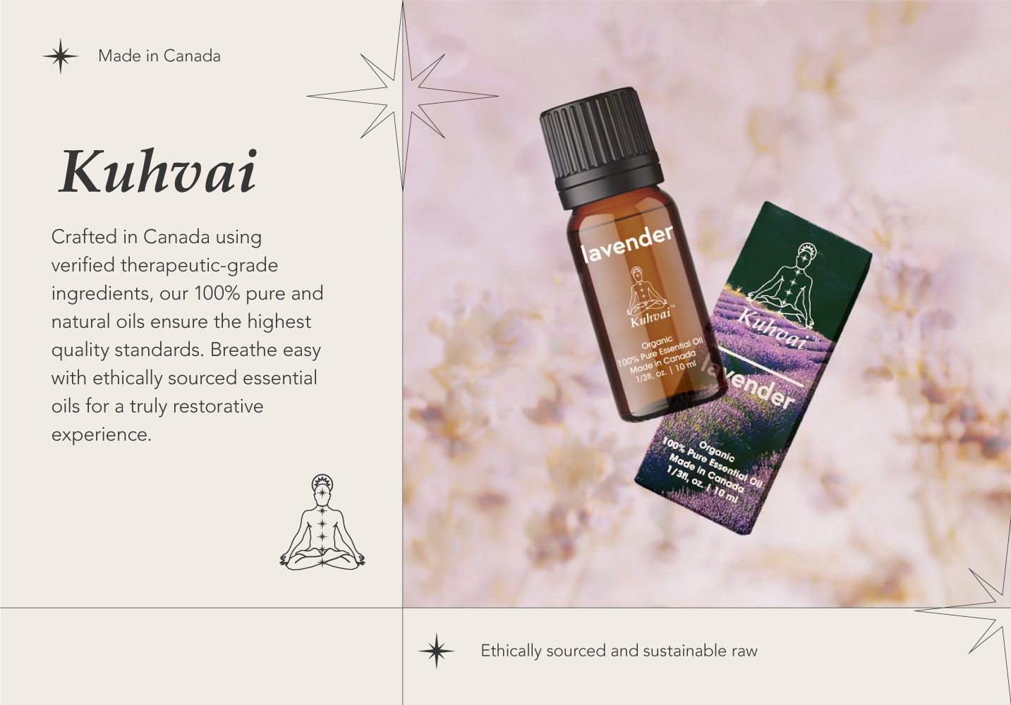
My solution was to develop a unique visual strategy that leveraged the power of colour and photography.
Each essential oil received a distinct visual identity:
Single-note oils: Background images directly depicted the plant or ingredient, creating a clear association between the oil and its source.
Blends: Images evoked the mood or benefit of the blend, sparking emotional connections for consumers.
This approach aimed to create an immersive customer experience, fostering a deeper understanding of each product.
Outcomes
-
The new packaging successfully established a distinct visual language for Kuhvai, setting them apart from competitors
-
The vibrant colors and evocative images resonated with consumers, strengthening the connection between the product and its packaging. This resulted in a more immersive experience for customers
-
Following the packaging redesign, Kuhvai's essential oils saw a significant boost in sales, achieving best-seller status on Amazon


